No. 5 The Trajan Capitals, by F.W. Goudy
This is a companion to Goudy’s earlier work “The Alphabet," but here he concentrates on the letterforms found on the 1st-century Roman column dedicated to the emperor Trajan. In the introduction and throughout the pages of comments on each letter, Goudy develops a powerful thesis. He refutes the commentators dating back to the 15th Century who have tried to prove that the essence of the Roman alphabet can be reduced to geometric combinations. In his own words, this perfect summation: “It is my opinion that not all letters, although composed of straight lines, circles and arcs of circles will necessarily submit to analysis or be reducible to rules of formation, since subtlety of line is not a matter of geometry, but of feeling.”
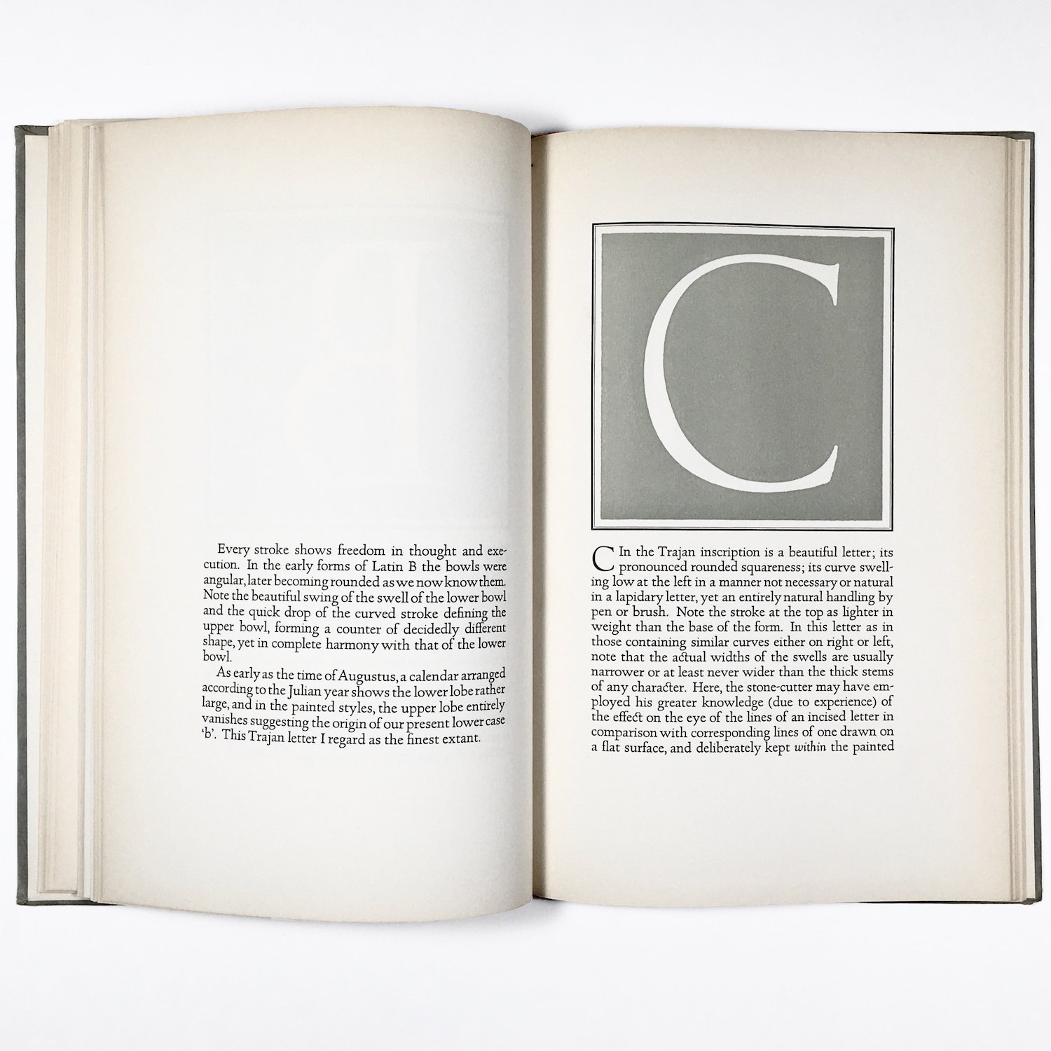
Goudy also answers the critics who point out that there is an awkward differing width to some of the letters, like the narrowness of E and B compared to the D or O. He feels the variations create energy and rhythm in combination. And also theorizes that these differences derive from the original pictographs of objects which are inherently of differing sizes. A snake will not evolve into an ox in width.
Goudy carved woodblocks that print the space around the capitals in a light olive color, leaving the letters as negative space. It’s an unusual choice and creates a book that is gentle and compelling while showing us very large letters. The text typefaces are uniquely designed by Goudy for this book, and it is elegantly laid out.